Dude Where's My Beer?

UX/UI, Mobile

2019 - Academic project

A beer companion app.

This project was the result of an assignment for the second semester’s class called Multimodal Interfaces, in the Faculty of Engineering of University of Porto. The goal was to put in practice the knowledge and tools we learned about user experience. 

I had the opportunity to work in this project with my talented friend Catarina Soares.

Product goals
Map the city

Provide our users with all the information they need about their favorite beers and where to find them.

Know our users

Discover which beers and places our users like the most, allowing them to rate their experiences.

Give meaningful recommendations

Based on our users preferences, we can recommend new places and beers, leading to great discoveries.

Why a mobile app?

Mostly because it is already a companion, in short reach, whenever people go out for fun. This way, our users can rate their experiences while they are happening. But also, we chose mobile because we make use of integrated navigation systems.

Research
User interviews and survey

We started this phase conducting 5 in-depth interviews, focusing on qualitative data. This was super helpful for us to validate some of our early hypothesis and assumptions. Our target audience was defined as young people, willing to try new and different kinds of beer. After the interviews, we used a survey for quantitative data. 

Here are some of the results and key takeaways:

0 %
Drink beer at least once a week
0 %
Like to try new beers
0 %
Consider price over quality
Personas

Based on the information we gathered from the interviews and survey, we defined our product’s two main user personas. This helped us to represent our target audience in a memorable way and we used it as a reference.

From now on, every design decision had to be in line with the goals and expectations of these personas.

Pedro, The Adventurer

24 years old, single, student, living in Porto.

End goals

Task goals

Marta, The Specialist

29 years old, married, managerliving in Lisbon.

End goals

Task goals

Prototyping
Wireframes

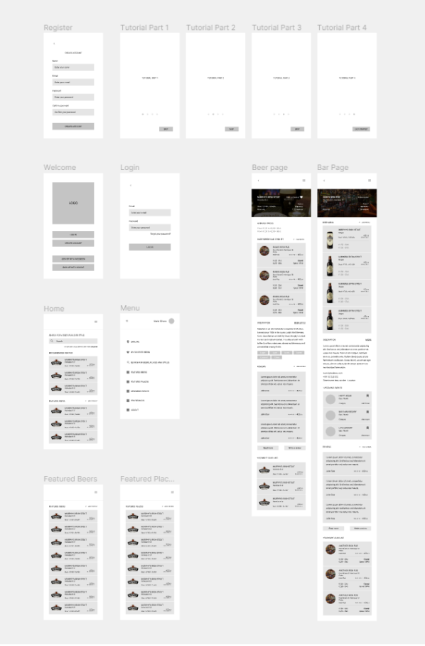
Based on our findings in the research phase, we listed the product requirements and their priority levels.

We then started the first sketches and wireframes, always referring to this list and also the best practices for mobile app design. Since this was an academic project with a very short deadline, we focused on the guidelines for Google Material Design, but there should be no problem adapting this design for iOS.

High priority

Medium priority

Low priority

User Testing
Usability tests

During this phase, we conducted usability tests with 5 people: 3 of them closest to the adventurer’s profile, and 2 closest to the specialist’s. Users were asked to:

The Adventurer

The Specialist

Key insights

Watching users interacting with our low-fidelity prototype gave us great insights.

Asset Library
Typeface

Roboto

Heading 1

Roboto Bold / 21px

Heading 2

Roboto Bold / 14px

Body

Roboto Regular / 14px

Button

Roboto Bold / 14px

Caption

Roboto Regular / 12px

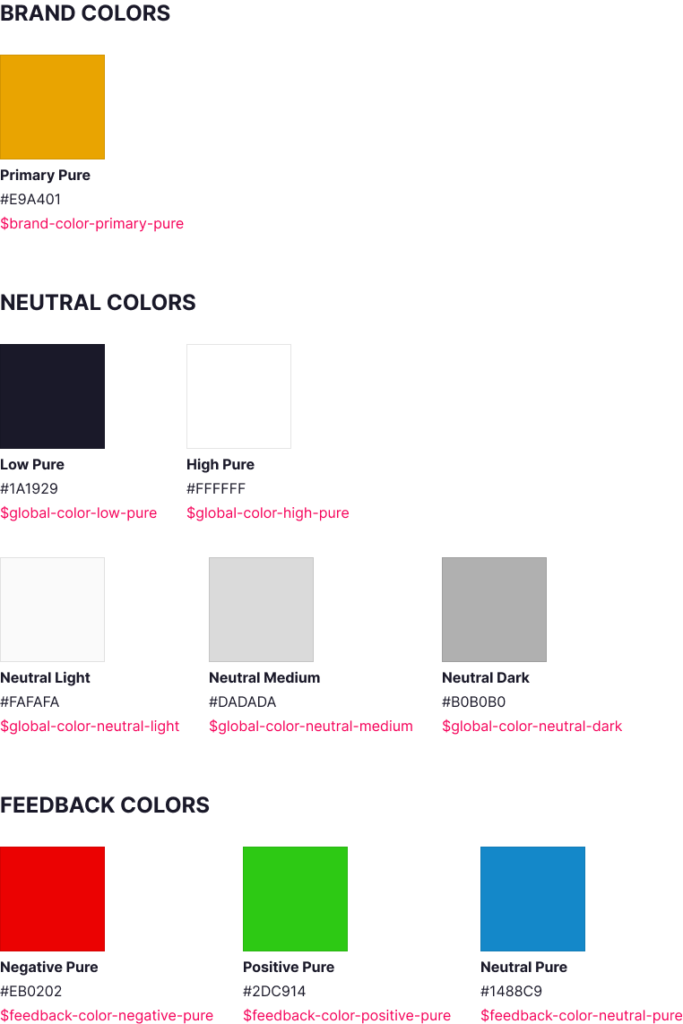
Colors
Buttons
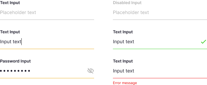
Input
Final Design