Magic: Story

UX/UI, Mobile

2021 - Passion project

An app for Magic The Gathering's narrative universe

I have always been a huge fan of Magic The Gathering, mostly because of the absolutely amazing art. When I was a child, I used to spend hours imagining the stories behind those awesome characters and places on the cards. So, as a way to pay tribute (and to exercise my skills), I developed the layouts for a concept application that could gather all the stories and informations about their narrative universe.
Magic The Gathering is property of Wizards of the Coast LLC, a subsidiary of Hasbro, Inc. All Rights Reserved.

This is a passion project. It is not not affiliated, associated, authorized, endorsed by, or in any way officially connected with Wizards of the Coast, or any of its subsidiaries or its affiliates. The official Magic The Gathering website can be found at https://magic.wizards.com/. The names, marks, emblems and images are registered trademarks of their respective owners.

Product goals
Seamless experience

Make it super easy to find and read new stories, as well as to track user’s progress.

Full databank

Provide our users with informations about characters, places and cards related to the stories.

Customizable

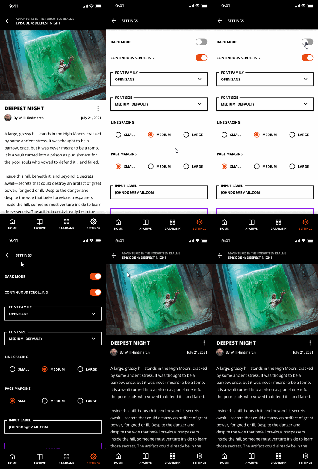
Allow users to fully customize their reading experience, with various font settings and dark mode.

Quick disclaimer

My focus on this project was to redesign an existing product, adapting its experience to a mobile app. For that reason, I decided to focus more on the interactions and design system rather than research methods. If you are interested in seeing how I usually conduct the research phase, please check out this other project.

Prototyping
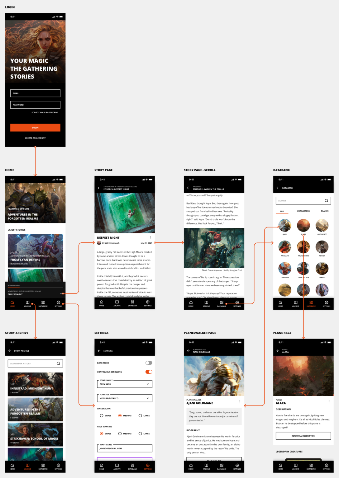
Wireframes and flow

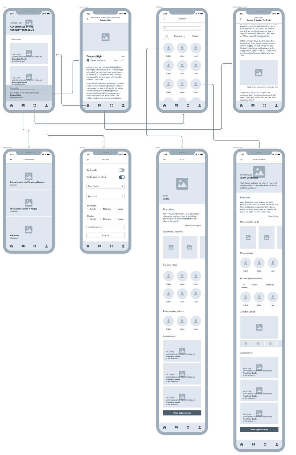
These are the sketches I did before actually building the final layouts. This step was fundamental to test the product’s structure and user flows in an agile way. Without the visual details, the iterations are way faster.

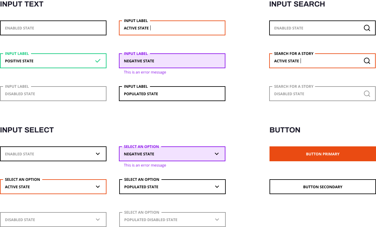
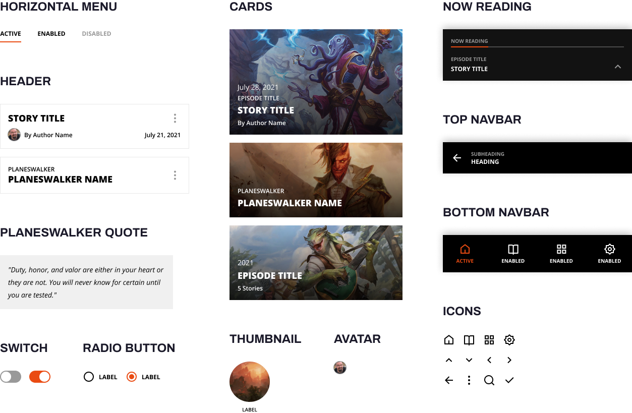
Design System
Typeface

I chose to use Open Sans, since it’s the font family that Magic Story uses in the original website. I tried to keep the style as close as possible to their already established visual identity.

Open Sans

Heading 1

Open Sans Extra Bold / 36px

Heading 2

Open Sans Extra Bold / 18px

Heading 3

Open Sans Bold / 14px

Heading 4

Open Sans Bold / 10px

Body

Open Sans Regular / 14px

BUTTON

Open Sans Bold / 12px

Caption

Open Sans Semi Bold / 12px

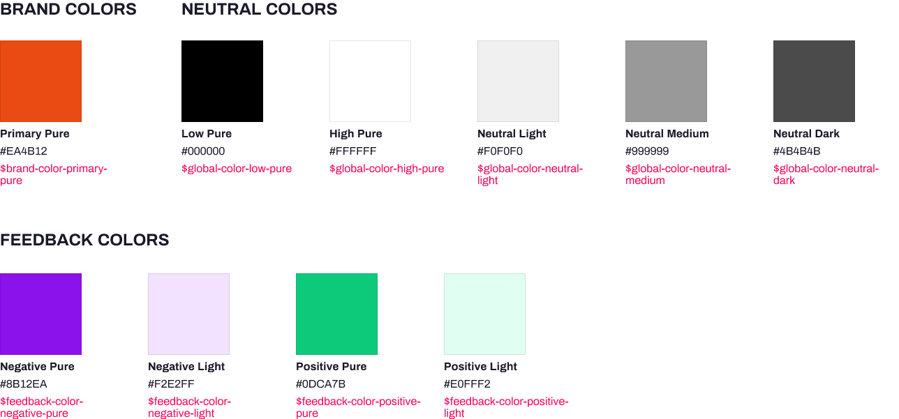
Colors
Components
Final Design
Dark mode friendly